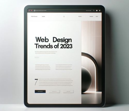
Web Design Trends that Convert: Boosting Engagement and Conversions

Introduction to Web Design Trends
In today’s fast-paced digital world, where first impressions are made in the blink of an eye, the power of web design is undeniable. It’s not just about creating a visually appealing space; it’s about crafting an experience that resonates with visitors, compelling them to engage, interact, and convert.
The evolving landscape of web design is a kaleidoscope of innovation, where aesthetics meet functionality. As we navigate the latter part of 2023, these trends are not just about looking good; they’re about strategic design choices that amplify digital success. From minimalistic layouts to immersive interactions, each trend serves a unique purpose: to engage the user and facilitate a journey from visitor to customer.
Minimalism and White Space
The Essence of Less is More
In a world cluttered with information and stimuli, minimalism in web design emerges as a breath of fresh air. This trend is about stripping away the superfluous, focusing on what’s essential, and presenting it in a clean, uncluttered format. But minimalism is more than just an aesthetic choice; it’s a strategic tool that enhances user experience in profound ways.
User Experience at the Forefront
Minimalistic designs prioritize the user experience by eliminating distractions, making navigation intuitive, and focusing the user’s attention on the most vital elements – your content and calls to action. This approach not only makes your website more enjoyable and easier to use but also significantly increases the likelihood of conversion.
White Space: The Unsung Hero
Often overlooked, white space is a critical component of minimalistic design. Far from being mere emptiness, it’s a powerful design element that gives content room to breathe. By incorporating ample white space, websites can guide visitors’ eyes naturally to key content and calls to action.
SEO and Load Times: A Hidden Benefit
An added advantage of minimalism and white space is their impact on your site’s Search Engine Optimization (SEO). Websites with clean designs and faster load times are favored by search engines, leading to better rankings. A study by Google highlighted that even a one-second delay in page load time can reduce conversions by 20%. In the SEO game, where every second counts, a minimalist design can be your secret weapon.
Bold Typography and Artistic Fonts
Speaking Volumes Through Type
In the realm of web design, typography does more than just convey information; it’s a pivotal element in brand communication and user experience. Bold typography is not just a trend; it’s a statement. It captures attention, creates an emotional connection, and helps in communicating the essence of your brand.
The right choice of typeface can significantly influence how users perceive and interact with your website. Bold fonts can evoke strength, reliability, or sophistication, while artistic fonts can infuse creativity and uniqueness into your brand identity.
Crafting a Distinct Brand Identity
Utilizing artistic fonts is like giving your brand a voice. When you step away from generic fonts and embrace unique typefaces, you establish a distinct brand identity. This differentiation is crucial in a crowded digital space where standing out is key to capturing and retaining user attention.
The strategy lies in finding the perfect balance. Pairing bold and artistic fonts can create a hierarchy of information, guiding users through your content seamlessly. Remember, the goal is to enhance readability and user experience, not to overwhelm. Avoid overly complex fonts that might detract from the user experience, and focus on creating a visually cohesive and accessible interface.
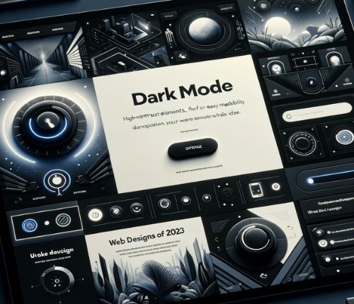
Dark Mode Design Options
Embracing the Dark Side
The popularity of dark mode in web design is more than just a fleeting trend; it’s a response to user demand for comfort and accessibility. Dark mode offers a sleek, modern look while providing practical benefits like reduced eye strain and lower battery consumption on devices with OLED screens.
This design option caters to the growing preference for customizable user experiences, allowing users to choose a theme that suits their environment or personal preference.
Enhancing Accessibility and Experience.
Implementing dark mode isn’t just about adding a switch for a darker color palette; it’s about ensuring a seamless transition between light and dark themes while maintaining the integrity of your design. It’s crucial to ensure that legibility and contrast are balanced in both modes, providing a comfortable browsing experience for all users.
Incorporating dark mode can greatly improve your website’s accessibility, catering to users with light sensitivity or those who prefer a darker interface for various reasons. This thoughtful consideration can enhance the overall user experience, demonstrating that your brand values inclusivity and user comfort.
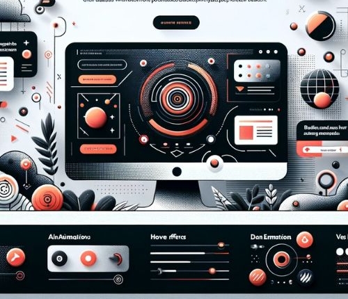
Interactive Elements and Micro-interactions
Bringing Websites to Life
Interactive elements and micro-interactions are like the secret spices that give a website its flavor. These small, engaging animations and effects play a pivotal role in enhancing user engagement and providing a dynamic user experience. They transform static pages into living entities that respond to user interactions, making the browsing experience more enjoyable and memorable.
Crafting Meaningful Interactions
The key to successfully integrating these elements lies in subtlety and purpose. Animations should be smooth and coherent, enhancing the user experience without overwhelming it. Micro-interactions, like a button changing color when hovered over or a small animation indicating a process, offer immediate feedback to the user, creating a sense of interaction and engagement.
Best practices suggest using these elements to guide users through your website, acknowledge their actions, and provide a sense of accomplishment. They should be intuitive, helping users navigate your site more effectively, not distracting them from their purpose.
Mobile-first Design Approach
Prioritizing the Mobile Experience
With the majority of internet traffic now coming from mobile devices, a mobile-first design approach is no longer optional; it’s essential. This approach means designing for the smallest screen first and then scaling up to larger screens, ensuring that your website provides an optimal experience for mobile users.
Seamless Experience Across Devices
The goal is to create a consistent and engaging experience across all devices. Your mobile site should be a reflection of your desktop site, but optimized for smaller screens. This means clear navigation, readable text, and interactive elements that work well on touch screens.
Responsive design is crucial in a mobile-first approach. Your website should fluidly adapt to different screen sizes, ensuring that it looks and functions beautifully on any device. Google’s mobile-first indexing also highlights the importance of this approach in SEO, as the mobile version of your site is what will be primarily used for indexing and ranking.
Neumorphic Design
A New Dimension in Web Design
Neumorphic design, or new skeuomorphism, is a trend that’s reshaping the landscape of web interfaces. This design style is all about creating a soft, almost tactile experience, blending the physical and digital worlds. It uses subtle shadows, gradients, and highlights to create elements that appear to be slightly extruded or embedded into the background, providing depth and texture.
Creating Depth with Subtlety
The charm of neumorphic design lies in its subtlety and its ability to create a clean, minimalistic look while still offering a sense of depth and interactivity. To effectively use neumorphic elements, focus on soft, diffused shadows and light color palettes that create a semi-3D effect. The goal is to provide users with a sense of familiarity and comfort, making the digital space feel more tangible.
However, the key to neumorphic design is balance. Overdoing it can lead to a cluttered and confusing interface. The design should enhance user engagement without overshadowing the functionality or the content. When done right, neumorphism can make your website not just visually appealing but also more intuitive and engaging.
Inclusive Design and Accessibility
Designing for Everyone
Inclusive design transcends aesthetic considerations, focusing on creating web experiences that are accessible to all users, regardless of their abilities or circumstances. It’s about acknowledging the diversity of users and ensuring that everyone has equal access to information and functionality.
Practical Accessibility Strategies
Here are some practical ways to improve website accessibility:
- Alt Tags for Images: Provide descriptive alt tags for all images. This is crucial for visually impaired users who rely on screen readers to understand the content of images.
- Keyboard Navigation: Ensure that your website can be navigated using a keyboard alone. This is essential for users with motor impairments who can’t use a mouse.
- Readable Fonts and Sufficient Contrast: Choose fonts that are easy to read and ensure there is sufficient contrast between text and background colors to aid users with visual impairments.
- Transcripts and Subtitles for Media: Provide transcripts for audio content and subtitles for videos.
- Responsive Design: Ensure that your website is fully responsive, providing a seamless experience for users on devices with varying screen sizes.
- Simple and Clear Navigation: Make your website’s navigation intuitive and straightforward, helping users with cognitive impairments to navigate your site more easily.
AI-driven Personalization
Tailoring Experiences with AI
The integration of Artificial Intelligence (AI) and machine learning into web design marks a paradigm shift towards creating highly personalized user experiences. In an era where users expect content and interactions tailored to their preferences, AI is the key to unlocking this level of customization.
AI-driven personalization involves using algorithms and machine learning to analyze user data, such as browsing behavior, interaction patterns, and preferences. This analysis then informs the dynamic customization of content, product recommendations, and overall user experience on the website, making each interaction unique and relevant to the individual user.
Chatbots and User Engagement
One of the most visible applications of AI in web design is the use of chatbots. These AI-driven assistants can engage users in natural, conversational ways, providing instant support, guiding them through the website, and even helping with decision-making processes. By offering a more interactive and responsive experience, chatbots can significantly enhance user engagement and contribute to higher conversion rates.
Conclusion
The Evolving Landscape of Web Design
The web design trends of 2023, from the tactile allure of neumorphic design to the cutting-edge personalization offered by AI, represent more than just aesthetic choices; they are strategic tools for enhancing user engagement and driving conversions. Each trend, whether it’s the minimalistic clarity of white space or the inclusive approach of accessible design, plays a pivotal role in creating a website that’s not only visually appealing but also highly functional and user-friendly.
As we delve deeper into the digital era, the importance of these trends becomes increasingly evident. They are crucial in meeting the evolving expectations of users and staying ahead in a competitive digital landscape. However, the key to success lies in the balance and integration of these trends, ensuring that they complement rather than compete with each other.


